|
The Zeltsman Approach to Traditional Classic Portraiture Chapter 16 Understanding and using the Language of Photography The Language of Photography My reference to the Language of Photography as an effective visual communicating medium is based on the fact that, our eyes are attracted to light, and in a mere glance at any image, our eyes go instantly to the brightest point within that image. Check it out! Gather several images of portraits of a variety of subjects. Proofs will do. Now do the following with each print. Pick one up and hold it in front of you, close your eyes, and now blink once or twice. What do you remember seeing instantly within each image? And now, consider the following: The primary point of interest of a classic portrait is the subject’s face and expression. The only way to keep the emphasis on the face, is by controlling and coordinating the various tonal values of clothing, background, props, etc.., The following series of illustrations will give you and idea of how these controls are planned.
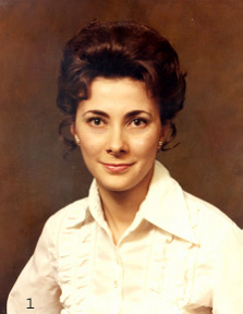
This photo shows what happens when you photograph a dark-haired woman wearing a light garment, against a dark background. The emphasis remains on her body, rather than on her face.
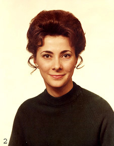
Here a dark garment offers good tonal coordination between her body and hair, but the light background causes a viewer’s attention to be evenly divided between the body, hair and face.
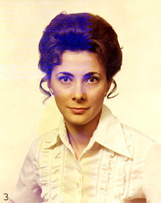
Changing to a light background achieves a tonal blend between the garment and the background, and attention is no longer on the body. But now, the dark hair competes with the face for attention.
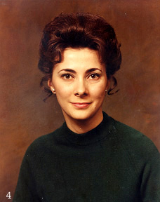
Here the total emphasis is on the subject’s face and expression. This effect is achieved by blending the body and hair with the background. Yet, one remains sufficiently aware of the subject’s body and hair styling to feel her total presence. As you can see, this method of visual communication enables you to plan and control exactly what you want to convey to the viewer.
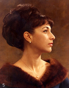
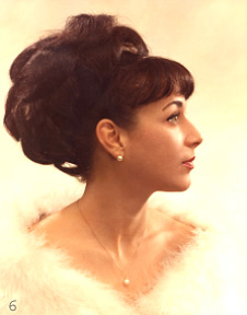
For example, you may be planning a head and shoulders portrait of a young lady’s profile, with dark hair arranged in a rather elaborate style. As illustrated here, you photograph her in a dark garment against a dark background, and her profile becomes the focal point of interest in this image.
If however, this photograph (#6) is not intended as a portrait, but is planned instead to illustrate the styling of the hair, you would photograph her in a light garment, against a light background, to achieve the desired effect shown here.
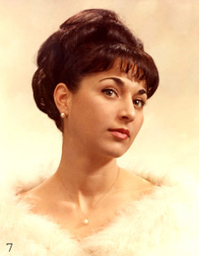
This photo shows another facial view of the same young lady. But due to the change in perspective, her hair style appears more subdued and quite attractive from this angle. You may decide that in this case, the viewer’s awareness of the hair may be desirable, and photograph her in a light garment against a light background.
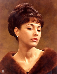
For sheer classic beauty however, this portrait (#8) is infinitely more effective. The planned tonal coordination achieved here by placing the dark garment and dark hair against the dark background, focuses attention fully on the face and expression. Similarly, the same planning applies to a subject with light blond color hair, by reversing the procedure. These examples illustrate how the emphasis is brought to and kept on the subject’s face, by a planned relationship of tonal values within the image. Another visual control important in creating an effective image is composition. A physical arrangement of the pose within the format of the image, with the subject’s face in a dominant position within the format, and all physical lines of the pose leading toward the face. |
|
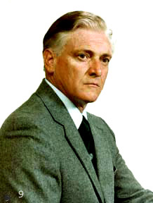
THE FILM FORMAT and THE PORTRAIT FORMAT In shape and form, people we photograph (men, women, children) are actually vertical objects, and therefore best presented within the vertical oblong shape of a portrait format, however they are posed. I make this point, because square film format cameras are widely used today, particularly by wedding photographers, who find the square format very convenient for capturing the various groupings and happenings during the coverage of a wedding, allowing them the option of final editing later. And of course, the square film camera is equally effective in capturing portrait images on film, just as other cameras of whatever film format shape and size. The final presentation of the properly cropped image (finished print) however, always fits best within the oblong shape of the Portrait Format. Using a Cropping Tool Negative sizes and formats vary, depending on a photographer’s choice of camera equipment. Yet, regardless of the difference in the size and shape of the film format, the composition of the image is obviously the same in all negatives, and must be cropped to appear in the final print exactly as planned to fit within a Portrait Format. Naturally, proof prints are needed for indicating the cropping of the final finished print. Commercially made cropping tools are available from some camera supply firms, usually in 4x5 and 5x7 (portrait)format. Or you may use a 4x5 or a 5x7 cardboard frame (photo folder) and cut it apart at opposite diagonal corners, to make two cropping angles to work with. Why Portrait Format??? The oblong shape of what is commonly referred to as the "portrait format" is most logical for framing portrait images of individual subjects in a variety of "vertical" poses. And the portrait format is even more important in head and shoulders poses, as I will illustrate and explain now. I borrowed the following from Chapter 5, "Posing Men, Part Two" to make the point here.
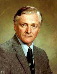
The primary aim in head and shoulders portraiture is to highlight and feature the main point of interest, the subject’s face. There should be no distractions within the image diverting the viewer’s attention from the face. Note however, in just a glance at this photo, how your attention is drawn away from the face by that large near shoulder, totally out of balance with the far shoulder.
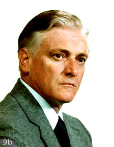
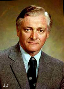
Of course, we can crop into that large near shoulder, as illustrated here (9-b), and bring it into balance with the far shoulder. But this close cropping leaves the face hanging in space without proper body support.
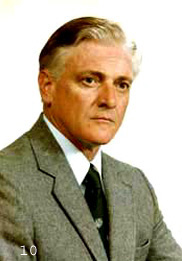
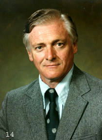
This photo illustrates the proper solution. The subject’s body is turned a bit more to the front, showing more of the far shoulder. We can crop into the near shoulder now to bring it into balance with the far shoulder, and note how all lines in this composition lead diagonally up toward the face.
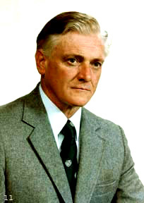
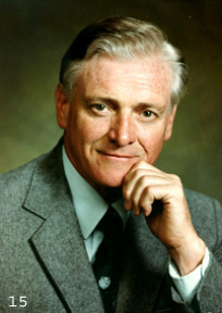
There is more. This photo shows the body turned still more to the front, to show even more of the far shoulder. Now, by cropping the near shoulder to balance with the far shoulder, the resulting more open cropping may be used to include more of the man’s body, if so desired. Reviewing the above important points of information Ÿ 1. In head and shoulders portraiture, the turn of the body controls the size of the far shoulder. That, in turn, controls the cropping of the near shoulder. Ÿ 2. That allows you to plan exactly the amount of the body in relation to the face. Ÿ 3. This flexibility of being able to control the visual size of the body, can be used very effectively in posing heavy set men. (And women)
The above example of controlling composition, deals with the appearance of the subject’s face. The pose in photo-12 is properly arranged in a masculine composition. But looking at it, you become aware of the stiffness on the right side of the face and neckline. Compare that with the relaxed, comfortable face and body relationship in photo-13. That was achieved by a slight turn of the body to the front, to relieve the tension on the neck. This method of controlling composition by cropping, can only be done using the shape of the "Portrait Format"
These two photos show how the visual aspect of, what I call "the Language of Photography" delivers the message of an image to the viewer. The emphasis in the portrait on the left (#14) is unquestionably on the subject’s face and expression, and that is the total message. The message in the portrait on the right (#15) is different, and saying more. You, the photographer, decides what you want your message to say, (perhaps both?), and arrange the tonal values and composition of the image to deliver your message. Planning three quarter and full length poses. Planning images of poses beyond the head and shoulders close-ups is a bit more complicated, and I decided to use some of my images to illustrate the necessary planning involved in creating those images. As we go along, you will note a common denominator in all my images. Regardless whether it is a portrait of a single individual subject, or of a group, when you look at my images, your attention is instantly drawn to the subject’s faces and expressions.
Planning poses beyond head and shoulders, always involve additional relevant, but secondary point of interest, as the hands on bible in this image (#16). Close your eyes for a moment, then blink a few times. You will see that your attention is drawn first to the face, and then to the hands and bible. This planned sequence of a primary and secondary points of interest is achieved by controlling the tonal values of the lighting. As you see, the subject’s face is lighter, and the eye is attracted to the face first. The pose is pure Classic Masculine Composition. Note, the hands are positioned at a height that brings the arms into slight diagonals, creating smoothly flowing lines between the face and hands.
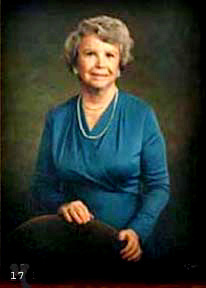
The elegantly simple formal portrait of this woman, is similar in treatment to the previous portrait of the man. But she is posed in a pure Classic Feminine Composition. As you see, her hands too are positioned at a height needed to achieve the slightly diagonal lines of the arms. The style and color of her garment was carefully chosen for its subdued quality, to help keep attention on the face.
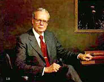
Portrait of an executive, photo-18. He is arranged in a Masculine Composition, and the primary point of interest here is the face. The lines of the shoulders and arms all lead the eye smoothly in a circle from the face to the hands and back. The portrait format here is horizontal, to display the image properly.
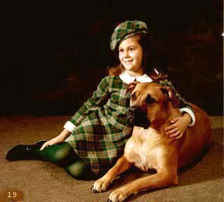
This is an obviously planned portrait, as indicated by the clothing, and inclusion of the dog. Note how the pose is arranged with all lines leading up toward the girl’s face and lovely expression. But, when you check it out by using my suggested blinking trick, it will unfortunately indicate that the primary point of interest here is on the dog’s chest. That can, of course, be remedied by retouching. But the client preferred to keep it that way. Occasionally, when there is a reason for it, we must settle for a slight compromise.
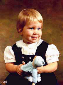
I am showing these two photos to illustrate my mistake of judgment in planning those images. In photo 20 on the left, the viewer’s eye is instantly attracted to the white garment. In photo 21, attention goes to the hair. The portraits are lovely as they are, you might say? That is true. But if I were to switch the backgrounds, the white in photo 20, and the dark in photo 21, the main emphasis in both portraits would be on the face and expression. An understanding of how to use the language of photography helps to create more eloquent images. (Such self examination helped me to learn that)
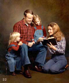
In full length portraits of groups showing the subject’s total figures, clothing coordination and tonal values must be carefully planned not to distract the viewer’s attention from the subject’s faces. Note through my blinking trick, that indeed, your attention in this image is drawn to the faces and the book, all at the same time. Note also how the composition of this pose leads your eye around from face to face to the book, telling the story of this image.
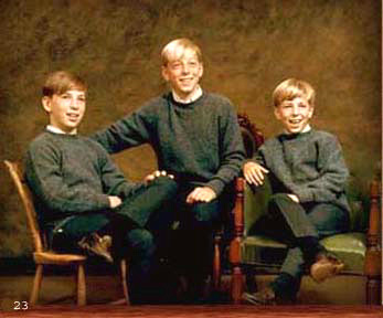
The relaxed casual grouping in this portrait (23) of three brothers is an excellent example of planning an image. An image like this doesn’t just happen. Clothing was discussed ahead of time of the booked sitting. And the pose in that image is not the result of a trial and error approach to see what I can come up with. That is what I planned the image to deliver to the viewer, and I posed each of them to form this grouping. A few comments about the last two photos, (22 and 23). It’s interesting to note and realize the different feeling each of these two images project to the viewer. In the image of the Family Story Time, all communication is between the members of the family, and we are excluded. It is a private moment in the family. The Three Brothers however, reach out to the outside to communicate with us.
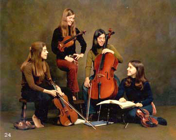
Four sisters musicians form this traditional string quartet. Mother requested a casual portrait showing them as they are when they rehearse at home. We discussed and deliberately chose dull clothing to set off the faces and the instruments. I arranged the players in a logical grouping. The young lady standing plays 1st violin. Sitting below her on the left is the Viola player. Sitting across from her on the extreme right if the 2nd violin player. And next to her right is the Cello. Their conversation is private, and the viewer is ignored, the same as the Family Story time.
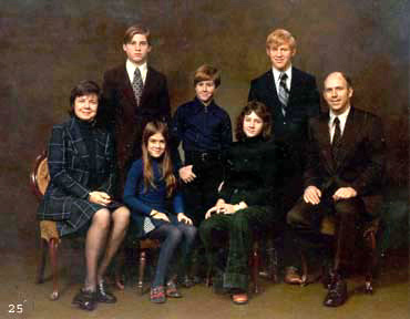
Here however (25), the people in this formal classic portrait of a family group communicate directly with the viewer. The important feature of this style of family group portraiture is, the viewer’s instant awareness of all the faces, and then, of the bodies showing the size and age relationship between the members of the family. You understand now, that this effect is achieved by preplanning the coordination of clothing and background. For details about my style of posing family groups, I recommend you turn to Chapter 8.
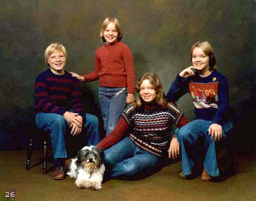
This relaxed casual grouping of four siblings, their dog, and warm smiles on their faces, is the end result of thoughtful planning, and reflects my particular approach to portraying groups. I don’t simply bunch people together. Instead, I arrange a grouping of effectively posed individuals, brought together to form the group you see here. In closing: I began this chapter with a specific aim in mind. To bring up a topic rarely discussed among photographers. The language of photography, and how to use it to create images that communicate and deliver your exact message to a viewer. I sincerely hope that my message has reached you. |
Rehosted on:

